Pentagonblues
Pentagonblues is a series of miniature paintings with industrial paint on a selection of photographs from the book 'The Pentagon. The Nerve Center of the US' from the early 60s. Wastyn only retained the photos with cars and he painted them over with blue paint to allude both to the broad concept of blues and to a chosen spectrum of blue colors.
Wastijn provokes the absurd contrast between the maniacally painted details and their magnification as wall posters or frescoes, turning small deviations into a visually almost grotesque commentary, not only on the Pentagon as an institution of power but especially on painting in general.

BLUE CAR
Blue Car works the other way around. A selection of publicity and promotional photos for cars from the 60s and 70s were painted over except for a few details. With these retained details Wastyn wants to arrive at a different 'script'. By painting over ready-made pictures, censoring the 'noise' and all human presence, Wastijn wants to play with the concept of authenticity and gives certain elements a more symbolic capacity.

Interview by Dr. Georges Petitjean
Same as in the exhibition there are always two titles. There are large murals, based on the Pentagon photos from the 60s, and then the smaller, artistic works based on magazines.
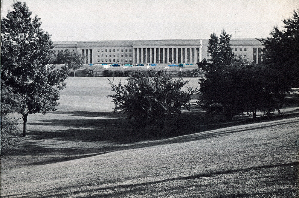
Pentagonblues is based on a 1964 book I found in a second-hand shop called “The Pentagon. The nerve center of US defences throughout the world”. I only used the photos of cars, which I painted over, while making sure they were still identifiable as such.
Blue Car is indirectly linked to Pentagonblues as these were promotional, advertising photos from the 60s and 70s. Here all the photos are painted over, apart from a few details of significance to the content. The cars are unrecognisable, just blue shapes on wheels.
‘Painter’ isn’t the right word. I’m not painting. These are more multimedia works. I work on the image in all its various guises. Blue Car is a multimedia work in as much as the photos are from the 60s and 70s, from car and in-flight magazines. The images are transformed by the paint and tell a completely different story in a different medium. The Pentagonblues miniatures are then blown up into wall posters, becoming the background for their own originals.
There is a dichotomy between the relative euphoria of the 60s and 70s, when cars were the embodiment of individual freedom, and the stark geopolitical realities of the time (oil crisis, Cold War, Vietnam War, etc.).
In the sixties the post-war economy obviously began to pick up. There was work aplenty, people had money to spend, and the car industry was in its heyday. Cars, though, run on petrol, hence the geopolitical crisis of the 70s. Both works are rooted in this sense of euphoria and the ideological protection of said euphoria.
‘Blues’ implies a sense of nostalgia: nostalgia for an era when cars still meant freedom, when there was little or no awareness of the environmental problems they caused.
Blues refers to a whole range of emotions. The truth is cars used to be the crutch that made us mobile and free. Now they have a completely different identity. Cars used to be a powerful symbol of freedom and comfort; they took us everywhere and showed our social status. Nowadays cars are more of a burden, more representative of stagnation and a lack of mobility. Electric cars are the new big thing but still you need to generate the electricity to power them. So, the problem has just shifted to what you need for batteries: cobalt mines and lithium fields.
The world was governed from the Pentagon, which resolved conflicts and guaranteed Pax Occidentalis.
This is an excerpt from President Lyndon Johnson’s speech from December 1963: “I look to you not only to protect your country, but to protect your country’s purse, to safeguard not only her military strength but her financial stability.”
‘Pentagonblues’ implies a sense of nostalgia for a past world that enjoyed relative peace and wealth under Pax Americana, a world now bogged down in a literal fight to the death.
Pentagonblues is in essence a graphic story in miniature. I took different car images I liked and painted them in a range of different blues. I did this to interpret the idea of ‘blues’ literally and also to provide the image with a sort of forced neurosis. At first glance it all looks neat and tidy, but in the second part of the work the image is blown up much larger and the graphic intervention becomes grotesque and awkward. Small ‘miscalculations’ have a huge impact. Pax Americana quite literally comes to life with the number of European cars (the Volkswagen Beetle, for example) in the Pentagon’s car parks. Ironically enough, the size of the car parks there led to actual disputes, as some spaces were adapted to European cars and thus too small for American cars. But that’s a story for another day. Presidential candidate Joe Biden wrote that American diplomacy must be restored “by the power of our example as much as by the example of our power”.

These smaller framed works are actually based on a magazine image, an illustration from an article in a car magazine from the 60s and 70s. We’re talking here about your childhood and teenage years, a subject that also raises the idea of transience.
In 1969 my father sat me in front of our black and white TV, and I saw little white men jumping up and down in slow motion. He said, “have a good look. They’re American and they’re on the moon.” I was just 6. A friend of my dad’s drove a Caprice Custom, a light-blue American car. Back then it blew my mind. For me the image of the Blue Car represented the sense of enterprise that had got the Americans to the moon. These works express the underlying link between selective memories and ideological temptation.
They look like paintings, miniatures possibly, but are in fact mixed-media works as they’re based on an original magazine photo. Back then they used different production methods to print magazines.
There are specific types of paper no longer used and they have both graphic and historical value. The old-fashioned printing method is a thing of the past, too. I use these beautifully-printed photos as my starting point. Ready-made photos and images. I just got stuck in and worked directly on these photos from the 70s, looking through the lens of how cars used to be marketed, where cars were linked to landscapes, family values, erstwhile fake exotica or sexy female models.
Overall, the only thing I left identifiable were the wheels and hubcaps. This creates two layers; the underlying layer of the old image and a new finetuned layer in paint. Most of the photographic information is painted over.
I kept all the wheels as they betray the identity of the main actor. That main actor isn’t actually the car but the photo underneath. The wheels are a constant reminder of the photo original. Just as when someone smiles, their teeth are a direct link to their skeleton. I wanted to separate all the painted elements in the image. That’s why they barely overlap… I did this by giving specific things a background (a colour halo) or a boundary, a tear in the image, a riff in the landscape. A link to the underlying layers of depth. A sort of low-tech media archaeology.
Below you can see a piece made of abstract surfaces and silhouettes. Even though the car is stylised, it’s still recognisable as the protagonist of a world reduced to its essence. By painting over the original photo image, other things come to the fore, and the fundamental illusion of freedom is removed. The image is reduced to its essence and makes the invisible visible.
I also wanted to give the landscape (and other elements such as window, flags, a bridge, the sea, a lighthouse) the same important role as the car itself. By painting away most of the image, in a sense I purify it. And that image is easier to deal with as all of the noise has been filtered out. The car becomes abstract. The person has gone, and any humanity has become part of this ‘driving tool’. The person has become its own object and its relationship with technology is portrayed simply.
The attack on the Pentagon on 11th September 2001, exactly sixty years after the iconic building’s first stone was laid on 11th September 1941, is an illustration of the challenges humanity faces in the 21st-century. This is mostly because nowadays it’s almost impossible to hide. You can’t cut yourself off from what’s happening in the rest of the world anymore. The ease we move from continent to continent with (migration included), and the digital world, now connect the most important places on the planet. Paradoxically this also means less freedom.
We live in a world where more goods and services move around than ever before. This has consequences. The Pentagon and other global watchdogs have recently been confronted with the smallest enemy ever: a virus. What’s possibly more dangerous is information and its polar opposite, disinformation. Information and the ease it can be obtained with come with a serious downside.The Big Five and Twitter do generate a large part of this often-gratuitous information and we as individuals all pay a price for it. We exchange our digital profile as payment to be able to use these platforms. The geometric shapes of Apple’s new headquarters (a large circle) and the Pentagon’s actual pentagon are very apt. Like brother and sister.
Cars too drove forward revolutionary developments in society. After the second world war, owning a car was seen as self-explanatory in the West. Nowadays the idea of owning cars is being called into question. Can we justify every single person on the planet having their own car?
Estimates put the number of cars in the world at 1.4 billion but only 5 to 10 million of them are electric. If all these 1.4 billion cars were electric, would that mean a geopolitical shift to lithium and cobalt to produce the batteries needed? Would we thus have to build more nuclear plants to generate that power?

In magazine ads in the 60s and 70s cars appear as part of the landscape, be it town or country, as if that was their right(ful) place.
All humanity has been removed from the ‘Blue Car’ works. The car is the only blue witness present, and it goes everywhere, as if it’s the most normal thing in the world, as if humans are just a vague memory. In fact, the blue cars fundamentally distort each image. They literally encroach into every inch available.
The digital world is all around us in modern society, sometimes to a perverse extent.
The Swiss-South Korean cultural philosopher Byung-Chul Han places the present in a smooth and frictionless state: Das Glatte. As little resistance as possible, any friction leading to negativity kept to the absolute minimum. The digital world fits right in here. That’s why I was liked these photos from before our digital era. Art can now be just that: something that creates friction. Art refuses to surrender. It can’t simply be erased.
The frame is an integral part of the work, wouldn’t you say? As you’ve just said, it can increase the impact the miniatures have. And the anti-reflective glass used affects the pictures too.
The frame is an ideal way of isolating each piece. The image is purer. The frame also lends a certain weight to the image, as much as it would a large painting. I use this small format basically because the originals are this size. They’re from magazines and you don’t collect magazines as objects as such. They only become personal when you leaf through them
I wanted to keep that personal contact when I worked on Blue Cars. In Pentagonblues the effect is twofold: close up very intimate, and from a distance more public, thanks to their being enlarged.
The anti-reflective museum glass works in a very subtle manner. The reflection seems to come from the glass, whereas in fact it comes from the paint in the photo itself. You can look at what’s happening without seeing your own reflection. The series has frames made of different types of wood evoking different ‘scenarios’. Each frame is well defined and absorbs the congested nature of the industrial paint perfectly.
Why the blue and particularly the light-blue? Light-blue is associated with the sky, and sky-blue is also the colour of Mary’s heavenly robe. So not necessarily a colour you’d think of to portray the harsh, glitzy colours of the modern automobile industry.
Allegedly Michelangelo left his ‘The Entombment’ unfinished around 1500 as he had no money left to buy ultramarine pigment. Italian merchants brought back the expensive blue pigment from Afghanistan, where it was used in Buddhist paintings.
Blue has always been expensive. Think of lapis lazuli in Ancient Egypt or other blue pigments in later periods. Astronauts say that the Earth looks like a lone, fragile, blue marble from space. Maybe the blue just represents the air and sea. Maybe it represents more... Ultimately the light-blue car takes on a more metaphysical dimension and we gradually forget the object itself.
We also say ‘blue blood’, a strong reference to people, admittedly of the nobler kind.
It’s a term associated with the nobility in 17th-century Ancien-Régime France. Lighter skin was seen as more noble, and if you were paler, your blue veins stood out more against your skin. My take on this, though, is the blue 1966 American Chevy Caprice Custom a friend of my father drove. It was a car that oozed charisma. It was more than a simple object for a specific purpose, when other cars were just named after the people who drove them. Having said that, even they eventually got parked on that huge car park outside the Pentagon.
Pentagonblues
Industrial paint on 1964 book paper


Blue Car
Industrial paint on 60s/70s magazine paper


